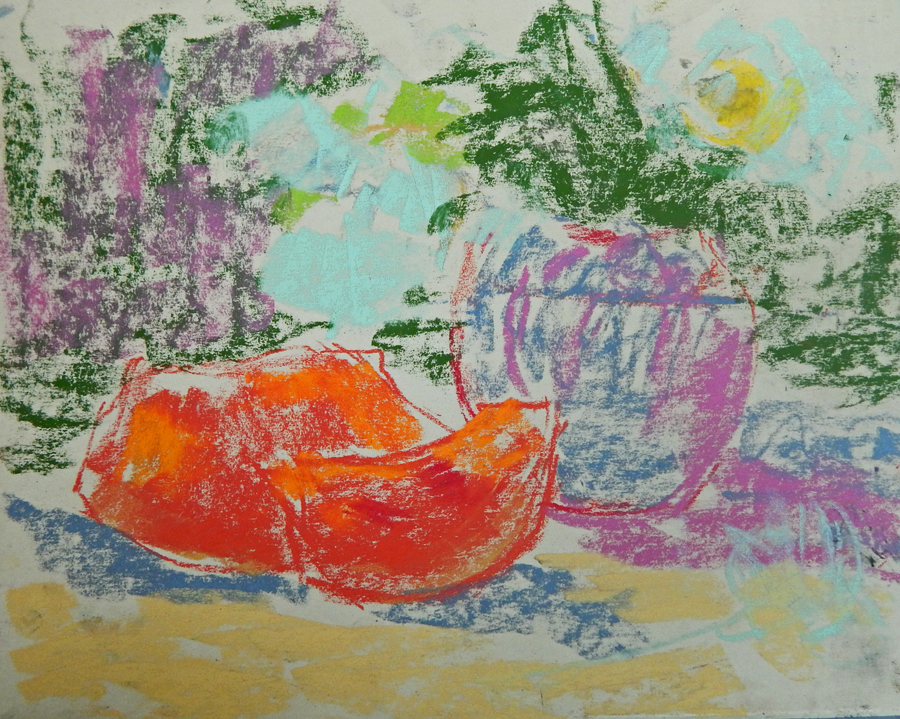
Here is a step-by-step demonstration of an outdoor still life with watermelons.
1.At the first stage I block do a sketch drawing blocking in colors of objects, keeping them of a medium value - not too dark not too light. In this still life almost all the object are of medium or light value. The darkest spots are the stems of roses and some leaves and the bottoms of watermelon slices. The right composition is the most important issue at this point.
2. I dilute colors with a rubbing alcohol staying loose. I don't worry about edges or drawing. I will do it with pastels later. The major thing at this stage are values.
3. I start working with pastels adding colors here and there, keeping the painting consistent in terms of colors, placing warm next to cool colors, cool to the warm ones, keeping some of colors almost pure, as those of watermelons - light yellow red and a bit of orange ( to show how full of light they are). I also add cool greens, violets and some pinks to the vase, warm yellow to the eyes of roses and cool blues and violets to other petals. I also keep a background darker than in real life to show a contrast between light bloom and dark background. I decide to add another slice to the foreground and a red rose to balance red and orange in the painting.

4. This is the final painting. I just work a bit more throughout the painting adding cool pink to the highlighted part of watermelons, some dark red to the shaded parts of the pulp; warm greens to the leaves and cool violet to the background; cool light pinks and yellows to the foreground. I also make sure that the whites of the roses are cooler and lighter in value and color than the whites of the cloth which is more warmer and yellow-pinkish. If you have several white objects in a still life you should decide what kind of whites are more important - in the flowers ( in their sunlit or shaded parts), the cloth or a jug ( its sunlit part, for example). Also, white may be closer to cool pink, warm pink, cool yellow, cool violet, warm gray, etc..
Also, you should establish a relationship between dominant colors in the painting. In this one it is a relationship between red-oranges of the pulp and blue-grays of the vase and shadows on the cloth and shaded parts of roses.